We encounter brand logos every day—on billboards, websites, and product packaging—without giving them much thought. While many logos are designed to be straightforward, some hide deeper meanings that are not immediately obvious. These logos contain subtle messages, symbols, and carefully crafted design elements that help make them memorable. Let’s take a closer look at the hidden stories behind some of the most well-known logos in the world.
1. Tesla: More Than Just a “T”
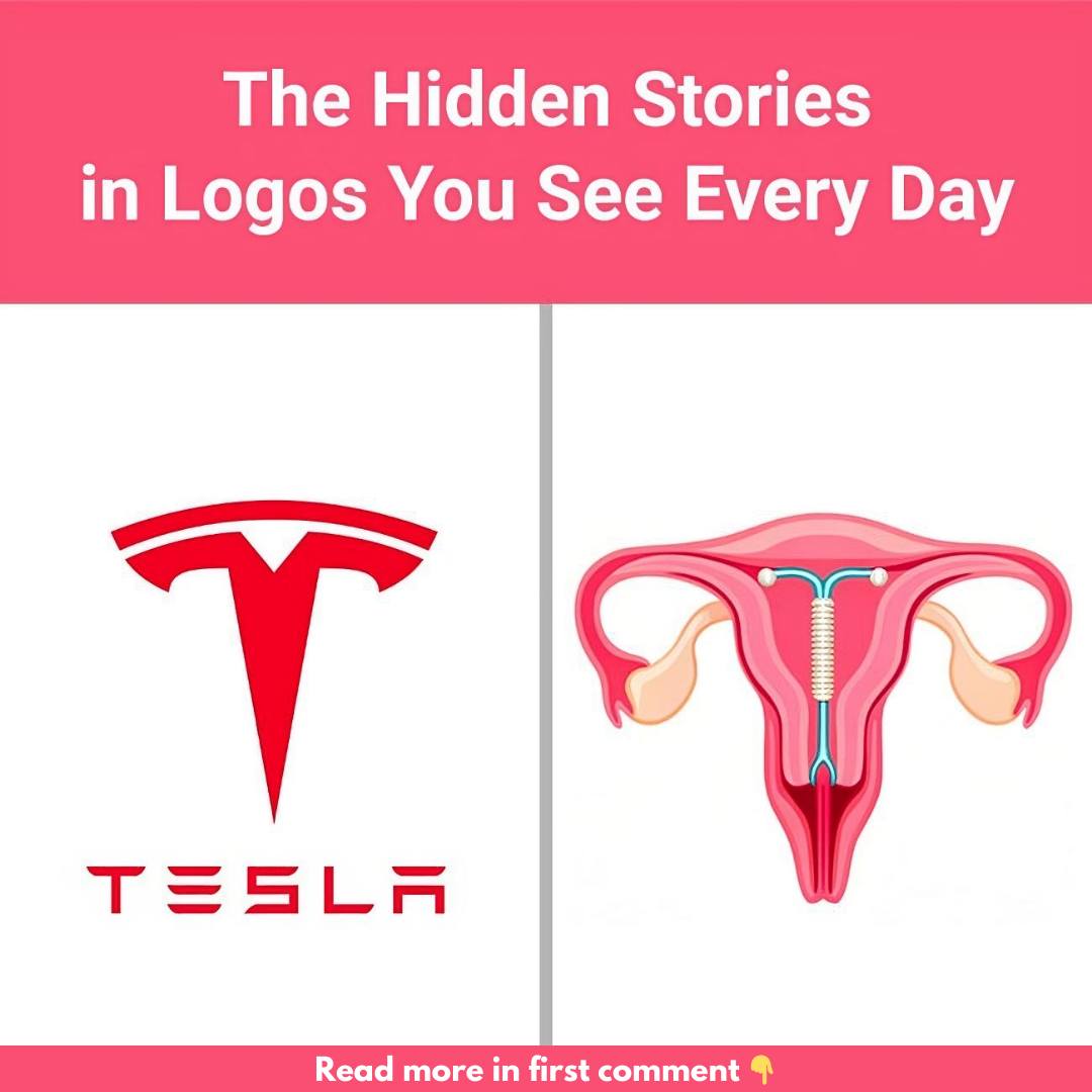
At first glance, Tesla’s logo looks like a sleek and simple “T,” representing the brand name. However, it holds more meaning than meets the eye. Some people say the logo resembles a cat’s nose or even an IUD, but the most widely accepted interpretation is that it represents a cross-section of an electric motor. This design nods to the electric innovation at the heart of Tesla’s identity, reflecting the brand’s commitment to cutting-edge technology.
2. The Friendly Face of Uncle Ben’s
Uncle Ben’s, famous for its parboiled rice, features the warm, familiar face of an older gentleman wearing a bow tie. This image is said to be modeled after Frank Brown, a maître d’hôtel from Chicago, whom the founders met in the 1940s. Brown’s approachable and friendly demeanor left a lasting impression, leading the brand to use his face to represent trust, warmth, and tradition. His face became synonymous with the comforting qualities the brand wanted to embody.
3. Amazon: A Logo with a Hidden Message
Amazon’s logo may seem simple at first glance, but it’s packed with hidden meaning. The smile created by the arrow pointing from “A” to “Z” not only symbolizes customer satisfaction but also suggests that Amazon offers everything imaginable, from A to Z. It’s a clever design that subtly conveys the brand’s wide product selection and commitment to happy customers.
4. Hershey’s Kisses: A Sweet Hidden Treat
If you look closely at the Hershey’s Kisses logo, you’ll find a sweet hidden surprise. Between the “K” and “I” in the word “Kisses,” there’s a small Hershey’s Kiss tucked into the negative space. This subtle detail adds an extra layer of charm to the brand’s playful and whimsical personality, reinforcing the idea that there’s always a little surprise waiting for fans of the iconic chocolate.
5. Quiksilver: A Wave of Inspiration
Quiksilver, the renowned surfwear brand, features a logo that combines a bold wave and a mountain. This design was inspired by the famous Japanese woodblock print, The Great Wave off Kanagawa, by artist Hokusai. The logo reflects the adventurous spirit and deep connection to nature that the brand represents, making it a perfect fit for surfers and outdoor enthusiasts alike.
6. Versace: The Mesmerizing Power of Medusa
The Versace logo features Medusa, a character from Greek mythology known for her beauty and deadly allure. Gianni Versace chose Medusa as his brand’s symbol because of her captivating power. The idea is that, just as those who looked at Medusa were enchanted, people would be similarly drawn to the beauty and allure of Versace’s designs. It’s a symbol of luxury and temptation wrapped into one iconic image.
7. Disney: A Real-Life Castle for Fairy Tales
Disney’s fairytale castle is synonymous with magic and childhood wonder. But what many people don’t know is that the castle is based on the real-life Neuschwanstein Castle in Bavaria, Germany. Built by King Ludwig II, this romantic and whimsical castle reflects the enchanting worlds Disney creates through its films. It’s a magical connection between real-life history and fantasy.
8. The Laughing Cow: A Logo with a Twist
The Laughing Cow logo features a smiling cow wearing cheese box earrings that mirror the cow itself. This clever design uses a technique called the Droste effect, where an image contains a smaller version of itself, creating a loop. This playful and memorable design fits the brand’s lighthearted and fun personality, making the cow an unforgettable symbol for the brand.
9. NASA’s “Meatball” Logo: Space Exploration in a Symbol
NASA’s famous “meatball” logo, created in 1959, is filled with symbolism. The blue circle represents Earth, the stars signify outer space, and the red chevron stands for aeronautics. The orbiting spacecraft highlights NASA’s mission in space travel. This logo is more than just a design—it’s a compact representation of NASA’s goals and history.
10. LUKOIL: Honoring Its Roots
LUKOIL, one of Russia’s top oil companies, cleverly incorporates a tribute to its origins in its name. The name is derived from the first letters of three oil-producing cities: Langepas, Uray, and Kogalym. By embedding these cities into its name, LUKOIL honors the places that are central to its success, creating a memorable brand that stays connected to its roots.
Conclusion: The Stories That Make Logos Unforgettable
Logos are more than just symbols—they’re crafted with precision and purpose, often hiding stories that reflect a brand’s values, vision, or history. Each of these logos carries a hidden narrative, adding depth and intrigue. The next time you look at a logo, take a closer look—you might uncover a story you didn’t know was there. Stay tuned for our next article, where we’ll share tips on how to spot counterfeit products and shop with confidence.